


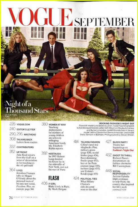
Notice how all of these examples technically serve the exact same purpose yet they are so drastically different in design, layout, and content? It's also quite interesting to see how all three of these magazines with completely different target audiences (From top to bottom: Billboard, Time, Nylon) alter certain things about their layouts to appeal to their T.A. My magazine, being very chic and high-fashion, definitely needs a simple and clean-cut design to appeal to my target audience. Here are some examples of table of contents but for magazines that fit into my category:

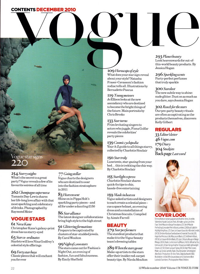
See the theme running through all of these examples? The simplicity, the sleekness, the clean-cut look, etc. This is the route that I am going to have to take in order to stay true to my theme and my target audience. I will brainstorm the layout and then obviously I will share it on this website. Hope you got to understand my approach towards my table of contents. Anyways, till next time, xoxo.
No comments:
Post a Comment