Here is my Creative Critical Reflection on my magazine, MIRAGE. Here I touch on several topics of interest involved in creating my magazine. Here is the link:
https://youtu.be/T65puegAX64
Miguel's Magazine Project
Tuesday, April 11, 2017
Monday, April 10, 2017
MIRAGE IS BORN
Ahhh!!! I'm so excited to announce that I am officially finished with my magazine! I am honestly so proud of myself and how I was able to learn and create such beautiful material in such a short amount of time. I am definitely very pleased with the result and I think it really represents me and my image. I hope you all enjoy it! Thank you to everyone who helped me through this whole process (teachers, models, friends, etc.). I will be posting my CCR sometime early tomorrow morning and then I am officially 100% done with this journey. Well, enough talking, behold! Here is MIRAGE:
https://www.canva.com/design/DACRv1ode_o/oxcfQre4_H40fEBcta1f8w/view?utm_content=DACRv1ode_o&utm_campaign=designshare&utm_medium=link&utm_source=sharebutton
https://www.canva.com/design/DACRv1ode_o/oxcfQre4_H40fEBcta1f8w/view?utm_content=DACRv1ode_o&utm_campaign=designshare&utm_medium=link&utm_source=sharebutton
Thursday, April 6, 2017
MIRAGE IN THE MAKING
Hey guys! I have finished my cover page and my table of contents. All I have to work on now is just the two-page spread (I will probably end up doing more than two pages) and the CCR. Here is my cover page:
I am staying true to my previous research of all the other magazines that relate to mine. Notice how I'm sticking to simply one coverline and a neutral color: black. I tested out a light pink for the cover but I did some more research on color psychology and I read that pink can sometimes come across as flashy or gaudy, and that is the exact opposite that I want for my magazine. The color black gives off a more elegant, modern, and sophisticated vibe. I decided to stick with one large coverline at the bottom of the image. Now, here is my table of contents:
I love the combination of the black and the red in opposite corners of the page. I separated the cover story from the remaining articles/spreads. Also, I tried to show that MIRAGE discusses a lot of different topics that appeal to all kinds of genders, races, ages, etc. I want my magazine to appreciate diversity in fashion & style. I tried to maintain a very simple, sleek, and minimal approach to the layout of both the cover and table of contents. Stay tuned guys, the finish line is getting closer! Till next time, xoxo.
Tuesday, April 4, 2017
The Pictures Are Here!
Hey guys!! So Stephany finally sent me the pictures from the photoshoot and I have already started creating MIRAGE. My plans are to be completely done with the magazine by the end of this week so I can have the weekend to work on my CCR. My last couple of blog postings this week will most likely be pictures, examples, layouts, and explanations of the creative process of creating MIRAGE. I will post how I plan to make my cover, table of contents, and what my two-page spread will be about. I am using this great online tool called Canva to create my magazine. So to give you guys a better idea for what my magazine will look like, I'm going to post pictures from the photoshoot but I will separate them into three categories: Cover image, table of contents pictures, and two-page spread pictures. This way I can show you guys which pictures I am considering on using for each section of the project. Without further ado, here are the pictures and the categories for which I'm considering them for:
COVER IMAGE OPTIONS


TABLE OF CONTENTS (RANDOM PICS)


TWO-PAGE SPREAD: INDIVIDUAL PICTURES OF MODELS


COVER IMAGE OPTIONS


TABLE OF CONTENTS (RANDOM PICS)


TWO-PAGE SPREAD: INDIVIDUAL PICTURES OF MODELS


Friday, March 31, 2017
Photoshoot BTS!
Guys!! I'm so happy with how the photoshoot came out! It could not have gone more perfectly. My models all looked amazing and we had such a great time, plus we got so much work done. I don't think a second photoshoot will be necessary. I did take a short video of me vlogging before we all headed out to the photoshoot. In the video you can see Daniela, Luis, and a brief view of both the Ana's. Stephany had just arrived when I started the video. I will upload it to this blog once I figure out how to do so. I actually used Stephany's camera for the photoshoot so I'm still waiting for her to export them to me so I can start editing and creating my magazine, I can't wait! I took so many pictures because I wanted to have a lot to choose from. Better to be safe than sorry, right? Anyways, in the mean time I have a few pictures of Luis, Daniela, and the Ana's that were taken with Luis' new iPhone 7+. But don't worry guys, once Stephany sends me all the pics I will post a huge stream of all the pictures so you guys can see how amazing they came out! Here are just a few pics that I gathered from Luis' phone:
Here is Daniela posing by herself on a set of bleachers at the community park near my house. Love love love her outfit! She looks gorgeous.
Here is Daniela again, posing with Ana E. Ana's top is a shade of pink that is all the rave right now, I loved that she incorporated that color for the photoshoot.
Daniela posing again, but this time she's kneeling in front of the bushes, giving this image a more colorful background. I don't know if I like this background more than the bleachers background?
Here is a selfie that Luis took minuted before we left for the photoshoot. His outfit was so street-style and exactly what I was looking for in my models. He looked casual and laid-back but at the same time trendy and stylish.
Just a quick selfie that the Ana's took on their way to the photoshoot!
Well, here are just a small amount of pictures from yesterday to give you guys an inside look. Again I will totally make another post with all the best pictures from the photoshoot. Till net time, xoxo!
Wednesday, March 29, 2017
PLOT TWIST!
I have some major news! I have decided to completely change my cover story for many reasons. Instead of doing an androgyny issue, I have decided to do a street style issue. I found that there is a lot more content that can be produced with this new idea, and there is a lot more that i can do with my two-page spread by taking this new route. With the androgyny idea, I really did not know what my two-page spread would be about because there really isn't a lot of directions that I can take with that topic. I figured that if I just write an article talking about how androgyny is increasing in popularity in the fashion industry, it would be rather boring and uninteresting. Also, I thought to myself that if I'm gonna create a fashion magazine, it should definitely be centered more around fashion itself. Don't get me wrong, androgyny and gender roles are still very much a part of fashion, but they're topics that can be discussed in several other kinds of magazines. I want my cover story to be something that no other magazine can take away from me.
So, what is street style you ask? To me, street style is the epitome of how someone wants to be viewed by others and by the world. Street style literally refers to one's stye when out and about, walking around the city, living one's daily life, etc. Street style is the first impression that any random stranger in the street will have of you. Street style is ALL about setting the first impression that YOU want others to have of you. With this topic, there is a lot more content that I can discuss. For example, I was planning on taking individual pictures of each of my models and then interviewing each model on their street style and their connection to fashion. I am much more excited that I chose this topic and don't feel like there is such a huge weight on my shoulders for having to figure out what I was gonna write about androgyny that could take up two whole pages. The photoshoot is TOMORROW and my models are ready with their outfits. I told them to dress exactly the way that they want to be introduced to my audience. I also told them to be completely authentic to themselves and to dress in the best way that describes their street style. We will probably be shooting in a very nice shopping area in Miami called Bal Harbour. I can't wait! I will keep you all updated on the photoshoot tomorrow! Till next time, xoxo.
So, what is street style you ask? To me, street style is the epitome of how someone wants to be viewed by others and by the world. Street style literally refers to one's stye when out and about, walking around the city, living one's daily life, etc. Street style is the first impression that any random stranger in the street will have of you. Street style is ALL about setting the first impression that YOU want others to have of you. With this topic, there is a lot more content that I can discuss. For example, I was planning on taking individual pictures of each of my models and then interviewing each model on their street style and their connection to fashion. I am much more excited that I chose this topic and don't feel like there is such a huge weight on my shoulders for having to figure out what I was gonna write about androgyny that could take up two whole pages. The photoshoot is TOMORROW and my models are ready with their outfits. I told them to dress exactly the way that they want to be introduced to my audience. I also told them to be completely authentic to themselves and to dress in the best way that describes their street style. We will probably be shooting in a very nice shopping area in Miami called Bal Harbour. I can't wait! I will keep you all updated on the photoshoot tomorrow! Till next time, xoxo.
Monday, March 27, 2017
Cover Image Thoughts
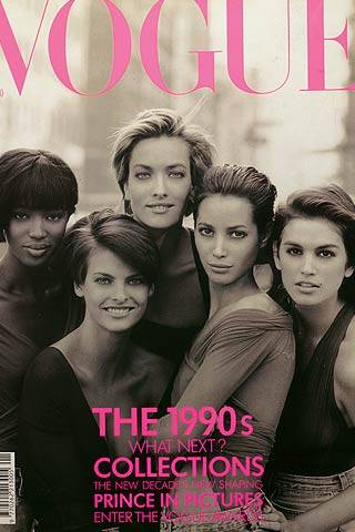
When it comes to such artistic and high-fashion magazines, the cover image must be electrifying, thought-provoking, and stunning. The fact that this particular issue of my magazine will be focusing on the androgyny movement that has been recently occurring in the fashion industry, I wanted to create an image that would make a statement to the blurring of gender roles in fashion. I want my cover image to portray several different messages on gender, sexuality, and femininity/masculinity and how all of these intertwine with fashion. I obviously want to take a numerous amount of images so I can feature them throughout my two-page spread as well. Now that I introduced my models in a previous blog, I want to give you guys an idea for what my vision is. Take a look at some of the most iconic vogue covers of all time:


Notice how the images are all incredibly captivating? This is what my cover image must embody. I need an image that will leave people thinking. Considering that the issue of my particular magazine will be such wide-ranging topic that can garner so much conversation, my cover image must have a lot of thought into it. I already discussed the minimal use of coverlines in a previous blog, but now I need to combine a minimal yet powerful use of coverlines and combine it with a strong cover image that can stand on its own. Take a look at this link for more background on the iconic vogue covers that revolutionized the fashion industry. As for my own cover, I will start brainstorming as much as I can to come up with a detailed idea for a cover image. I'll definitely get back to you guys with my cover image idea before the end of this week. Till next time, xoxo!

Notice how the images are all incredibly captivating? This is what my cover image must embody. I need an image that will leave people thinking. Considering that the issue of my particular magazine will be such wide-ranging topic that can garner so much conversation, my cover image must have a lot of thought into it. I already discussed the minimal use of coverlines in a previous blog, but now I need to combine a minimal yet powerful use of coverlines and combine it with a strong cover image that can stand on its own. Take a look at this link for more background on the iconic vogue covers that revolutionized the fashion industry. As for my own cover, I will start brainstorming as much as I can to come up with a detailed idea for a cover image. I'll definitely get back to you guys with my cover image idea before the end of this week. Till next time, xoxo!
Subscribe to:
Comments (Atom)


